Use these guidelines to effectively represent and promote Sallar in your marketing efforts, whether it’s through advertisements, articles, websites, or printed materials.
Sallar Brand
Logotype
Sallar’s wordmark is designed with a sleek, modern typeface that combines minimalism with futuristic aesthetics. The rounded and geometric lettering emphasizes clarity and innovation, creating a professional yet approachable feel. The wordmark’s simplicity complements the dynamic symbolism of the logomark.
The logomark is represented as a two-headed serpent, whose flowing form symbolizes infinity. This design emphasizes continuity, adaptability, and transformation, while the two heads symbolize duality, protection, and balance. The vibrant turquoise color reinforces a sense of energy and technological progress, while the dark background provides a sharp contrast that ensures readability and impact.
Clearspace
To maintain visual integrity and ensure the logotype remains distinct, a specific amount of clearspace is required around both the logomark and wordmark. This spacing helps to avoid interference from surrounding elements such as artwork, imagery, or page edges. Below are the minimum clearspace guidelines for the Sallar branding.
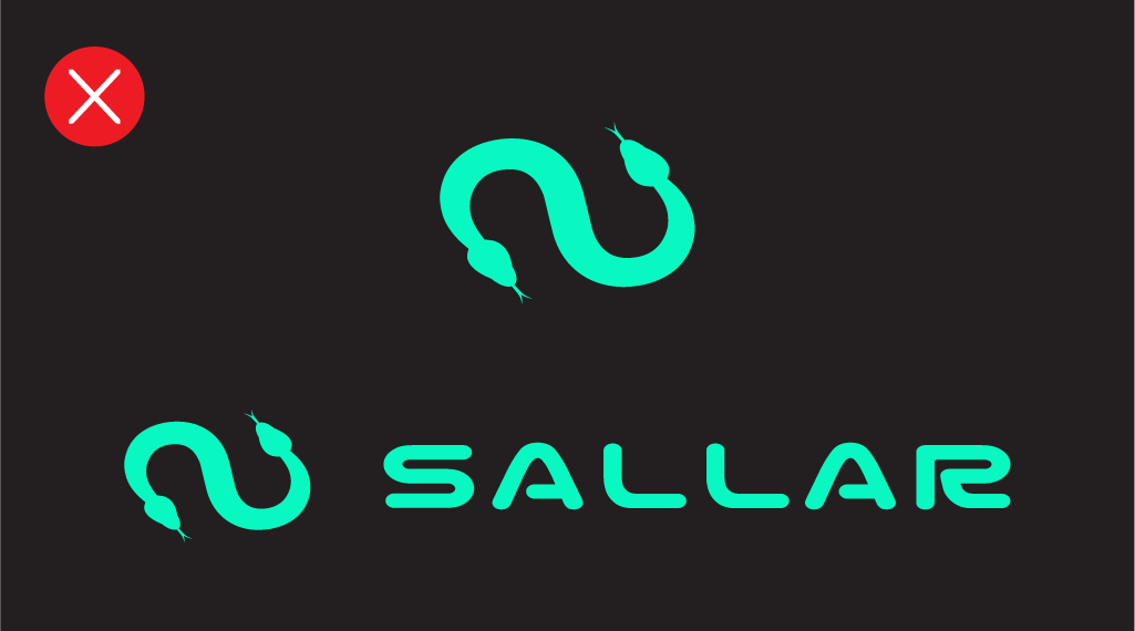
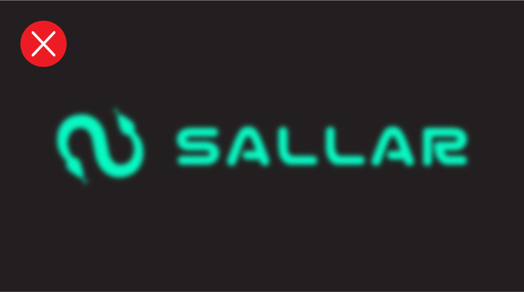
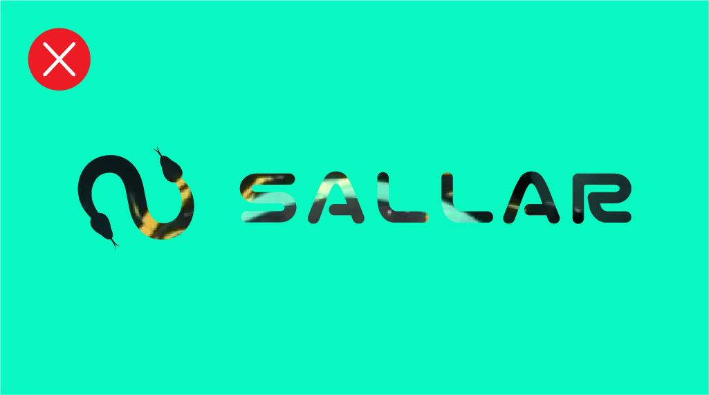
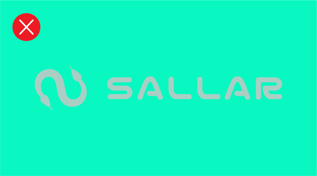
Logo Dont’s
Here are some things you should never do with the Sallar logomark.


